
The Lexis diagram belongs in the demographer’s toolbox like a mechanic’s wrench. It is the essential tool for visualizing lifelines and events as they occur along the intersection of age, (time) period and (birth) cohort. This means it is of great use to scientists doing longitudinal, time-to-event and even time series analyses. As such, it can also be of use to sociologists, epidemiologists and statisticians, but many experts in those disciplines seem unaware of it! Unfortunately, demographers may be to blame.
The Lexis diagram, perhaps because it is so simple, is not often mentioned in research papers. I am convinced that many demographers use the diagram, but simply forget to mention it in their papers (or believe it is not worth mentioning). This makes sense, as we also don’t credit our notepads for helping us conduct our research. The consequence is that the diagram gets less exposure than it should, meaning scientists who haven’t followed an introductory course in demography are unaware of it. Fortunately our blog isn’t a scientific paper, which gives me the opportunity for an homage to the Lexis diagram.
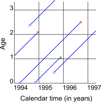
Figure 1. Lifelines in a Lexis diagram. Blue dots represent subjects entering the study, red crosses an event (e.g. mortality) and a green triangle represents censoring.
Before touching upon the history of the diagram, and evaluating its use in contemporary research, what is a Lexis diagram? Age can be found on the vertical axis of the diagram and time (usually in calendar years) on the horizontal axis. Figure 1 shows a diagram, together with some lifelines and events. Figure 2, on the other hand, is an example of how to visually represent a method of calculating life years lived using a Lexis parallelogram; same diagram, different use. I’ve also seen Lexis heat maps, where the squares, triangles or parallelograms in the diagram are given a darker or lighter colour reflecting higher or lower rates (respectively) of some event under study.
Importantly, the diagram wasn’t always constructed in the manner shown above. Initially (around the year 1870), scientists simply looked for a diagram in which they could show date, age and moment of death together. Wilhelm Lexis was among these scientists, but very likely not the first one. The creator of the diagram may be a scientist named Brasche, or perhaps Zeuner. They came up with earlier formulations of the diagram, to which Lexis added a network of parallel lines… he also made other adaptations, but many of these adaptations are not used today. Therefore, to put it crudely, it looks like Lexis was merely the biggest loudmouth and that’s why we refer to it as the Lexis diagram today. The name of the Lexis diagram is therefore an excellent example of Stigler’s Law: “No scientific discovery is named after its original discoverer”. A much more in-depth documentation of the diagram’s history was made by Christophe Vandeschrik, so I won’t describe it further than that.
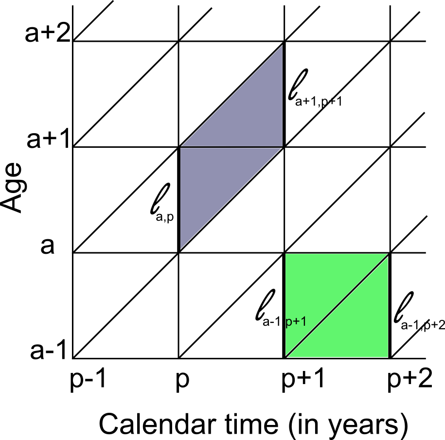
Figure 2. Calculating lifeyears in a Lexis parallelogram (blue selection) or a Lexis square (green selection). In the parallelogram, this could be done by taking the average of the number of persons alive at age ‘a’ and calendar year ‘p’ and the number of persons alive at age ‘a+1’ and year ‘p+1’.
Doing a search for ‘Lexis diagram’ or ‘Lexis chart’ in academic databases does not bring up many results. The papers that do turn up are almost all written by statistical demographers. In particular, the diagram is popular among scientists doing age-period-cohort (APC) modeling. One of the best accounts on this topic is described by Bendix Carstensen and Niels Keiding in their text on ‘Statistical inference in the Lexis diagram’. APC modeling is essentially about the attempt to separate the effect of age, time and birth year on some response variable (usually mortality). For example, research has shown that birth year can be an important determinant in cancer mortality, whereas we also know that age and period time are important factors to take into account, hence the reason why we would try to separate these effects. It is therefore advised to graphically represent rates by age and cohort over time. For example, the Lexis diagram with heat maps can be used to make an assessment of rates, and whether they are period, cohort, or age related (e.g. stronger cohort trends would show up as diagonal lines). The human eye can find such patterns whereas a computer running a statistical model may not. The software to make Lexis heat maps is rather outdated, though using standard graphical software should suffice (I tend to use Inkscape). However, I recently found that this topic is getting attention again by some important demographers! Also, there exists an R-package which to visualizes lifelines in a Lexis diagram.
There is recent research using ideas from the Lexis diagram, for example a method of dealing with right-censored data, or as a tool to help construct databases. This shows that the Lexis diagram is still alive but, to be fair, not particularly kicking. While evidently the diagram can be used to visualize data with a longitudinal component, this is not often done. If we want the poor (but useful) diagram to truly flourish, or at least to extend its life line, I suggest we give it a bit more exposure. In particular, we should use it in communication with scientists from related disciplines doing longitudinal or time-to-event analyses such as epidemiologists, sociologists and statisticians.
Maarten J. Bijlsma is an editor of Demotrends. His personal website can be found here.

[…] This text was posted on Demotrends by Maarten Bijlsma om april 23, 2013. The original can be found here. […]